I have really struggled with designing the look and feel for my website. I think the reason for this is because I tried to already put my website together without actually knowing what my elements are going to look like.
So I went and did some exploring on Awwwards
I like the home page of this website it is very minimalist yet effective
Navigation
I really like the way this navigation scrolls horizontal and the individual elements then become bigger and move when you move your mouse over them – I could do this with the different Numbers I am using – could be my menu
Look and feel
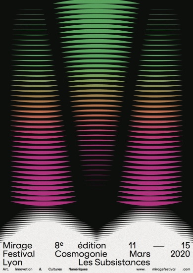
This poster reminded me of my sound waves and I like the way they used type at the bottom
